Project Brief
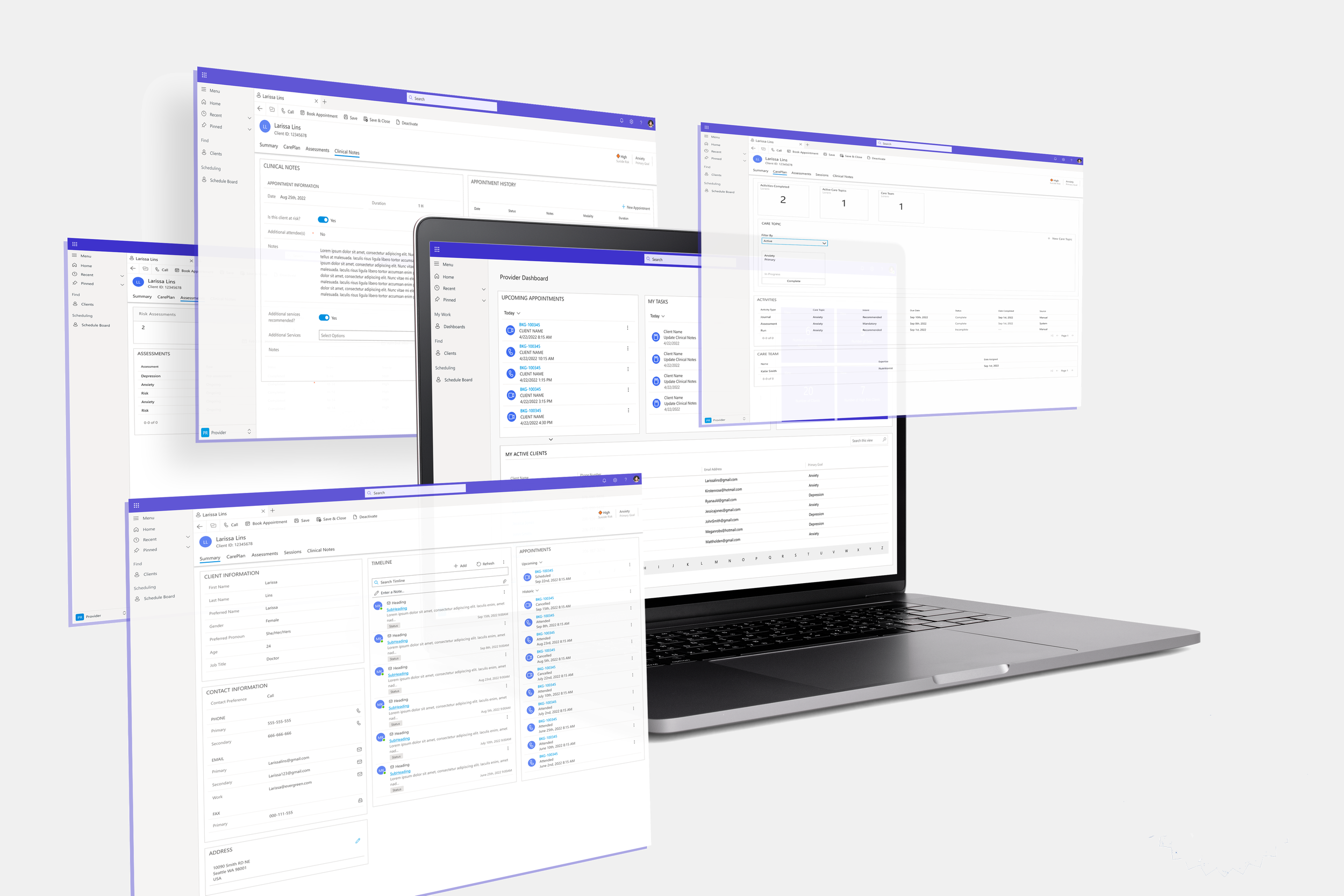
The counselor dashboard addresses the needs for a centralized workflow designed specifically for counselors, enabling them to efficiently manage daily tasks and patient interactions.
Company: Lifeworks
Role: Product Designer
Microsoft Dynamics 365
The Challenge
The existing system was fragmented, requiring multiple platforms, leading to inefficiencies and a poor user experience.
👩🏽 User Goal:
Counselors need a centralized dashboard to manage appointments, document sessions, and streamline assessments efficiently.
📈 Business Goal:
Improve efficiency and user experience by providing an all-in-one solution that enhances productivity and service quality.
🎯 Impact: 70% faster task completion by centralizing counselor workflows.
User Research
To ensure the dashboard truly met user needs, I owned and conducted 10 user interviews with counselors. I identified key pain points that shaped the design approach:
100% of users were frustrated with fragmented information
100% of users were frustrated with the complex Interfaces
90% of users were frustrated with session notes being Inefficient
80% of users were frustrated with the lack of attachment capabilities
User Flow
I owned and mapped out the ideal user journey to create a structured flow
1️⃣ Login – Logging into their personalized dashboard.
2️⃣ Dashboard Review – They review upcoming tasks, appointments, and patient sessions.
3️⃣ Confirm Appointments – Ensuring their schedule is up to date or if there's any cancelations.
4️⃣ Session Preparation – Reviewing patient profile notes, previous assessments (mental health forms), and setting up the next patient session.
5️⃣ Conduct Session - Conduct the Therapy session with the patient & Scheduling follow up sessions
6️⃣ Capture Insights - Document all therapy notes for that session and add any attachments (i.e hand written notes or assessments)
Low Fidelity Wireframes
With a strong grasp of user needs, I created low-fidelity wireframes aligned with research insights and stakeholder expectations, shaping user stories and key platform features.
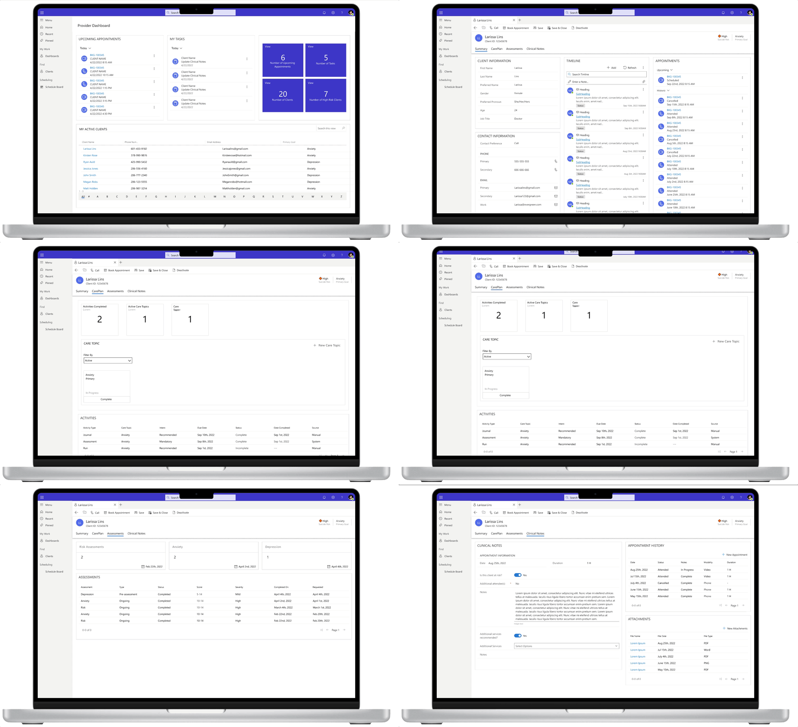
Core patient profile screens:
1️⃣ Dashboard/Summary – High-level patient details.
2️⃣ Care Plan – Goals, progress tracking, and assessments.
3️⃣ Clinical/Therapy Notes – Space for counselors to document and upload attachments.
These wireframes translated insights into actionable solutions, enabling early feedback and iteration.
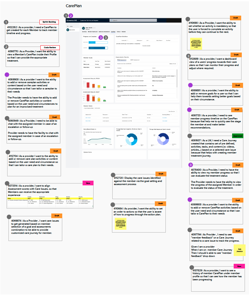
User Stories
A major challenge was the absence of structured user stories at the project’s start. Developers began coding before UX finalizing designs and interactions, and stories were frequently updated without clear communication from BAs, leading to misalignment. I took ownership of solving this by:
Creating a centralized Mural board
Organizing a daily cross-functional meeting
Integrating Azure DevOps
Result: This improved communication, reduced rework, and kept the team aligned on priorities.
User Testing
After integrating the low-fidelity wireframes and user stories for the MVP scope, I took full ownership of this phase by developing a low-fidelity prototype and conducting user testing sessions with a group of 5 counselors.
During the sessions, users were asked to complete 5 task scenarios using the prototype, followed by a post-test survey to gather feedback and insights.
Top Key Takeaways:
90% Agreed to Change the Top Tab Names for Patient Dashboard
Summary > Member Dashboard
Goals & Assessments < Assessments
Clinical < Clinical Notes
100% agreed the counselor dashboard needs to show up to 20 active clients
100% agreed to add Care Team to CarePlan
100% agreed the flow from the counselor dashboard to patient profiles was intuitive and information was easy to find
Building a Design System
Designing within Microsoft Dynamics posed two key challenges:
1️⃣ Limited customization – I worked with developers and a test environment to explore solutions.
2️⃣ No design system – I co-led the creation of one, ensuring consistency, efficiency, and adaptability.
Results:
✅ Ensure consistency
✅ Improve efficiency
✅ Streamline iteration
This initiative saved time, standardized designs, and established a scalable foundation for future projects.
High Fidelity Wireframes
Using the design system, I created high-fidelity wireframes with reusable components and standardized UI patterns, ensuring consistency, scalability, and efficient workflows.
Summary
Learnings:
Navigating ambiguity requires strategic prioritization and collaboration.
Ownership and accountability drive high-impact results.
Data-driven design ensures measurable usability gains.
High standards and scalable solutions drive long-term efficiency.
Future Opportunities - If I Had More Time
Post-Launch User Testing - Conduct additional testing post launch to improve and iterate more based on user feedback
Scalability Testing - Test with larger user groups and higher data loads to ensure long-term performance and usability.


